
Showing posts with label infographic. Show all posts
Showing posts with label infographic. Show all posts
Monday, 10 December 2012
Monday, 28 May 2012
Monday infographic: How common is your birthday?
Haven't you ever noticed how birthdays seem to come in a rush?
Well, some clever people got together and analysed birth data between 1973 and 1999 and came up with this great chart showing the commonness of certain birth dates.

The data is for North America so some of the stats would be a little different for us but I still think it's pretty interesting. For example, September births in Australia don't signal all the winter / christmas snuggling people get up to in December. However it seems to me that I know an awful lot of September babies, so maybe we do still enjoy a bit of extra holiday 'cheer' even in the heat.
Not surprisingly, 29 February was the least common date. Valentine's day sticks out like a sore thumb as the most popular day in February as does 30 December. Looks to me like April and November babies might be the rarest. And first of October? That's all those people getting frisky at New Years ...
Monday, 21 May 2012
Monday infographic: How a book is born
Today's infographic comes courtesy of the Huffington Post and is titled: How a book is born. Anyone written a book and can confirm the process for me?

Image courtesy of Mariah Bear via Huffington Post.
Monday, 14 May 2012
Monday infographic: top 10 most read books in the world
Today’s
info graphic is of the top 10 books of the last 50 years, by the number
purchased. No 1 is obvious, no.2 is obvious when you think about it. The others,
one or two surprises for me but I’m not up with the publishing world.

Designed by
Jared Fanning and found on Visual News.
I’ve read 5
of the 10 – Harry Potter, Lord of the Rings, The Alchemist , The Da Vinci Code
and The Diary of Anne Frank.
Friday, 11 May 2012
Five for Friday no.18
As we all know the Federal Budget was released on Wednesday. This interactive budget shows you how it has been divided up. And a great little article by Annabel Crabb on
how the surplus was achieved.
The Scale of the Universe. Everyone will enjoy this one, it is a bit mind-blowing.
Animal photographers. Very beautiful.


Tumblr from an LA based magazine editor, full of hilarious gifs.
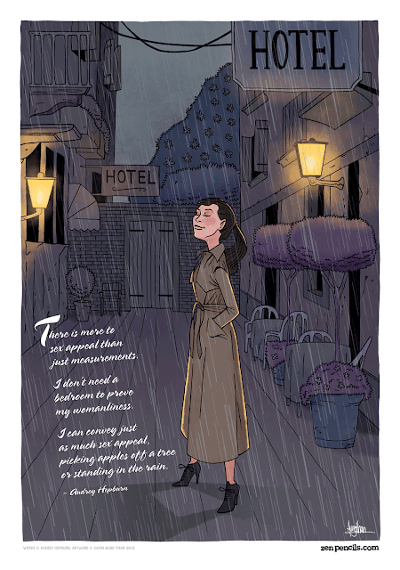
Zen Pencils : Cartoon quotes from inspirational folks. I rather like this one by Audrey Hepburn:
And I need to remember this one from time to time.

The Scale of the Universe. Everyone will enjoy this one, it is a bit mind-blowing.
Animal photographers. Very beautiful.

By Sharon Montrose.

Yeah, chickens can be arty too. Photographs by Tamara Staples.
Zen Pencils : Cartoon quotes from inspirational folks. I rather like this one by Audrey Hepburn:
And I need to remember this one from time to time.

Monday, 23 April 2012
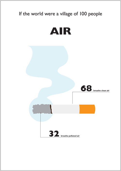
Monday infographic: the world as a village of 100
We're all pretty familiar with these 'If the world had 100 people' diagrams. What makes this one a little different is that it is a) beautifully designed and b) a little more detailed.

Done by Toby Ng Design, they are an international design-award winning set of graphics, now being turned into posters, postcards and a book.
Some of the stats are unsurprising,such as those relating to nationality and gender. These were a little more left-field and surprising to me at least:


And some are just plain clever.


This is Toby Ng Design's webpage, with all 20 graphics. You should take the time to check them out.
All images are the property of Toby Ng, taken from his website. No copyright or reporduction infringement intended.

Done by Toby Ng Design, they are an international design-award winning set of graphics, now being turned into posters, postcards and a book.
Some of the stats are unsurprising,such as those relating to nationality and gender. These were a little more left-field and surprising to me at least:

And some are just plain clever.


This is Toby Ng Design's webpage, with all 20 graphics. You should take the time to check them out.
All images are the property of Toby Ng, taken from his website. No copyright or reporduction infringement intended.
Thursday, 8 December 2011
So, I'm a Twitter fan. Not an obsessive fan, just a fan. I got into it for work and then socially,now I tweet most days ... this is starting to sound like an addication but really, it's not. As a social platform Twitter is fun and useful and revolutionising communication while being the new ultimate time-waster. It can be an interesting place to 'hang out' and a lot of the cool things I talk about on this blog I find directly or indirectly through Twitter. I have even posted an info-graphic on Twitter [I love info-graphics].
What I am posting about today is the yearly round-up of Twitter. The twitter-powers-that-be are slowly releasing their year in review, with lists of the most trending topics, which note-able people joined and also interesting news stories that have a basis or tie with Twitter. My favourite was this story of a guy in Portland, Oregon who saved his Mum's bookstore with one tweet. It's kind of amazing story and you can either watch it just below or read about it and other Twitterworld stories online. There are also cool facts like the most tweets sent in one second - which wasn't for the moment Brasil were eliminated from the Copa America, though at 7,166 tweets it came close - or that #Eygpt was the most used hastag all year, and that Charlie Sheen, who only joined Twitter in March 2011 was the most talked about actor. Twitter - it's not just about meaningless drivel.
Monday, 28 November 2011
Monday infographic
Today's infographic is about coffee. Because I love coffee. I love meeting people for coffee. I love the excuse of coffee, I love the taste of coffee. The only thing I don't particularly like about coffee is the smell. Yeah, go figure. Anyway, DesignTaxi have a gorgeous infographic on 17 trivialities about coffee.

Monday, 1 August 2011
The trustworthiness of beards
Another sweet info-graphic (because who doesn’t love info graphics), this time on the trustworthiness of beards. I’m not sure I agree with all of it but I think it is pretty accurate. Especially the placing of the neck beard in ‘threatening’, because neck beards are manky and indicative of certain laziness and lack of self-care.
If you have a bearded man in your life or you are thinking of inviting one in, please take a look at this helpful chart to gauge just how trustworthy they are and perhaps take the necessary precautions.
Subscribe to:
Posts (Atom)